

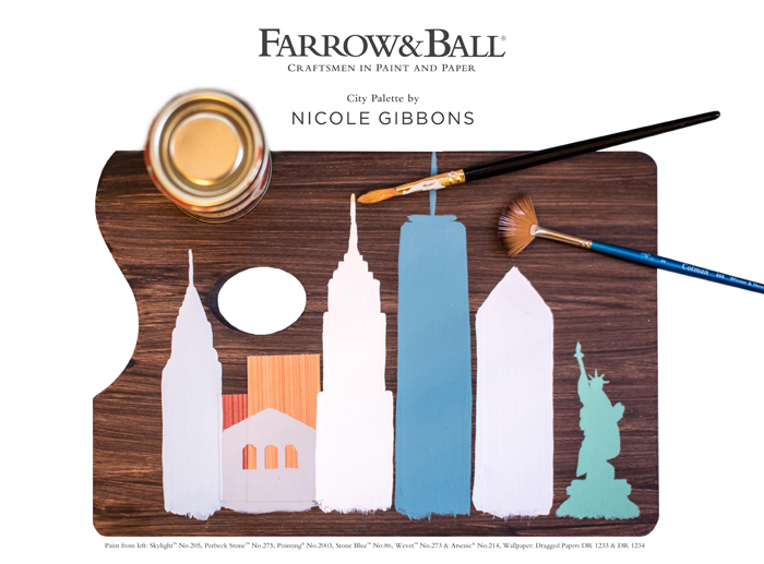
I have a few go-to brands that I love for interior paint and one of them is Farrow & Ball. So you can imagine my excitement when the Farrow & Ball team asked me to curate a palette of paint colors and wallpaper patterns inspired by New York City in celebration of the brand’s new blog, The Chromologist. There’s so much inspiration to be found in the streets of New York so with the City as my muse I created a palette of 6 versatile paint colors and 4 wallpaper patterns that evoke the spirit of my favorite places in the City – from stunning architectural landmarks and the beauty of Central Park to the colorful facades found in my own neighborhood of Harlem. Here’s a closer look my Gotham inspired City Palette for Farrow & Ball…
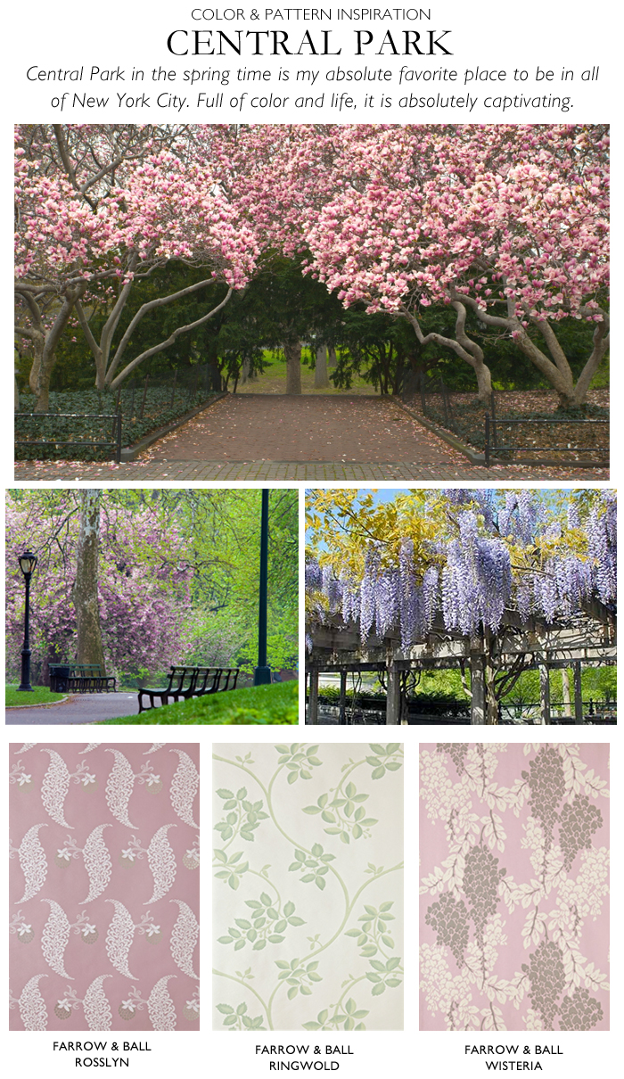
I think Central Park in the springtime is hands down the most beautiful and peaceful place in all of New York City. These picks were inspired by the flowering cherry blossom and tulip trees, the greenery and climbing vines found all over the park and the hidden gem which is the stunning wisteria pergola in the park’s observatory. From L-R: Rosslyn, Ringwold & Wisteria wallpapers.
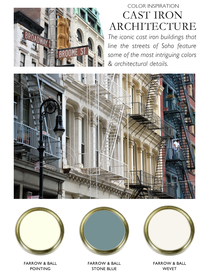
The cool, downtown neighborhood of Soho has more cast iron buildings than any place in the world. Cast iron was a popular choice of construction material for building facades in the late 19th century because it was inexpensive and easily pliable. These buildings line the streets of Soho and feature surprisingly sophisticated color palettes. Inspired by these architectural gems, I picked two perfect shades of warm and cool white and paired them with a steely blue for contrast. From L-R: Pointing, Stone Blue & Wevet.
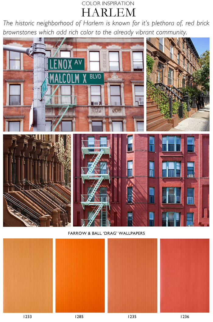
I might be biased because it’s my neighborhood:-) but I think Harlem is arguably the most vibrant and culturally rich neighborhoods in all of Manhattan. I also happen to think Farrow & Ball’s classic Drag strie wallpaper is one of the brand’s most vibrant and versatile offerings, available in more than 40 colorways. The colors I chose here were inspired by the distinctive red brick buildings and coveted brownstones that are abundant in Harlem. Drag wallpaper colors from L-R: 1233, 1285, 1235, 1236.
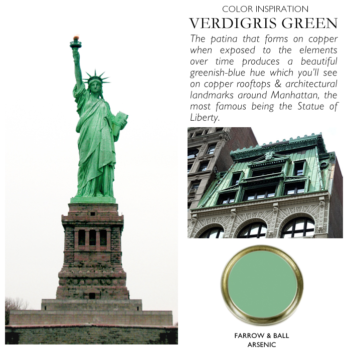
Throughout Manhattan you’ll find architectural features covered with verdigris which is an oddly striking greenish blue patina that forms on copper structures as oxidization occurs over time. Many old Manhattan buildings feature copper roofs with verdigris and you’ll also find it on fire escapes and other architectural landmarks throughout the city, the most notable being the Statue of Liberty. Farrow & & Ball’s Arsenic is the perfect shade of verdigris green.
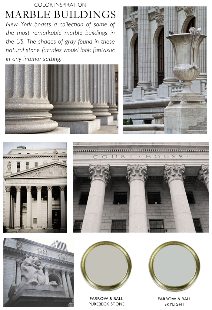
The New York Public Library and the city government buildings in downtown’s Civic Center are some of my favorite landmarks in the city and feature impressive marble facades in soft shades of gray which would look fantastic in any interior setting – or even on a piece of painted furniture! Left: Purebeck Stone, Right: Skylight.
I hope you enjoyed this little story of my city as told through Farrow & Ball color. Be sure to check out The Chromologist for more color inspiration and if you’re in New York I’d love for you to join me on June 17th from 5:30-7:30pm for an evening of cocktails, canapés and fun DIY paint projects at the Farrow & Ball Flatiron showroom. Email your RSVP to flatiron@farrow-ball.com. Space is limited!


7 Comments
Wonderful post! Thanks so much for sharing!
This is mesmerizing; an opportunity well channelized and compiled. You have selected some of the most fantastic colors and places. Especially the treatment with the statue of liberty and Central park, they look stunning. Thanks for sharing this visual delight 🙂
What a beautiful and original collaboration with Farrow & Ball. Gorgeous!
Congratulations, Nicole!!! That is such a wonderful new opportunity for you! I’m a big fan of blue, so my favorite color in your new palette is “Stone”. Overall, the entire color scheme is bright, bold and memorable. Love, love, love!
Really a impressive collaborations with farrow and ball color to attract anyone. Wanna thanks to Nicole for great post.
These colors are really a nice work!
Thank you, really nice – Arsenic is now one of our most selled colours