

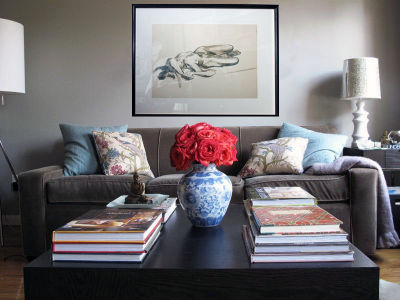
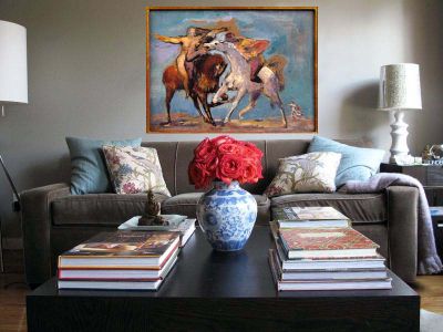
I’ve been trying to figure out what to do with the wall behind my sofa for a while now. When I first started decorating my apartment, I wanted to create a Vicente Wolf-esque environment, almost gallery like, with picture ledges displaying black and white photographs all over the place. So I bought a picture ledge from West Elm and tried a number of different arrangements of photos before settling on what you see above and soon realizing that I didn’t really love the whole picture ledge look as much as I thought I would (at least not in my apartment.) A little laziness combined with much indecisiveness is why almost two years later my wall is exactly the same. I’m finally ready for a change and I really love the look of a gallery style wall, but I also like the impact that a single, large scale statement piece can have. I can’t decide! This weekend I had a little bit of time on my hands so I put my photoshop skills to work and did some mock ups of what my wall could look like. One of the things I love about having a design blog is that I have a built in community of interior designers and design enthusiasts who I can turn to when I need design advice. So…what’s your vote? Gallery wall or statement piece? Have a look at the renderings below and let me know what you think!


23 Comments
I like either the grouping of many different pieces of art or the one large scale color rich piece. Another option is a large scaled abstract piece. I definitely do not like the lone vertical. Your sofa and other furnishings are very attractive.
Marion from KY
Gallery is the way to go. Your mock-up is stunning. If you have any friends that are artists they could help you with this “collection” in no time.
Dana
I like the gallery idea but not the placement of the artwork per se. My ex hangs for his gallery as well as mine. He also consults to a couple of museum curators and we’ve gone round and round about ‘what goes where’ – the basic idea is great though and I agree with Marion from KY, your furnishings are very attractive.
(obviously the above is my/our personal taste – I usually tend to group in a more traditional fashion, with larger art on top I think it’s the pale pink piece mid-right that is throwing it off for me. I would probably balance it out against the coral-pink – again, my opinion). I like the lone horizontal b/w but that is only if it’s a stunning, ‘important’ piece that you LOVE – otherwise it’s sort of okay placement. You could amend it by placing two pieces next to it, slightly off-center (on the left, where you do not have a table lamp) – about the size of the small gold framed piece you have in the gallery rendering….try that in a rendering and see if you like it!
thanks for letting me jam my 30cents in here!
Your place looks great! I would avoid the gallery wall…it has really been done ad nauseum. I like the horizontal oil painting with rich colors….I would also look for a piece with some texture… I think the room could use some different textures. Don’t forget to light it properly…would be very dramatic!
I would place the last colorful oil painting to the left side of the couch for a strong asymetrical vertical statement. I would then find complementary pieces – not matchy-matchy but perhaps with similar content or some color notes – and hang them in the remaining field over the couch. Kind of like a collage. They don’t have to be framed art per se, but could include photos, fabrics, sheet music, poetry… whatever has resonance for you. Have fun!
I like the green lady to the left and then two or more stacked on the right.
The collection; try garage sales. I had fantastic luck with getting massive quantities of cool stuff with the framing already done!
I like the gallery wall, which seems to go well with your stacks of books.
But what I really envision is a huge Twombly inspired painting that you could create yourself. Just purchase a large canvas and let yourself go.
Like this: http://www.decorpad.com/photo.htm?photoId=5621
Google Twombly images for more inspiration.
The first option is the best – the gallery style wall. It will take time, but with patience (which I also have not much of) it can be fun building your collection.
Hmmm…I am such a sucker for gallery walls:) Great space!!!
I like the fifth option. The painting pulls all the colors together and it makes the room feel more alive.
I love the gallery wall. I think it makes your space looks warm and cozy, and has a rich and lived in feel to it. Just having one piece above the walls feels a bit sterile to me. In the end, its your beautiful home to decorate. Good luck!
My vote is the the oil on canvas or the gallery. but i love your place. What color is that on your walls?
what a coincidence! i was just staring at the blank wall over my sofa thinking ‘what to do…gallery style or large framed print/image..” i’ve only been in my apartment for a month though, but i imagine it will start to drive me crazy soon.
can’t wait to see what you decide. i’m sure it’ll look great – your living room is gorgeous!
Thanks so much everyone for all of your comments and feedback!! I’m so happy to have everyone weigh in! So here’s where I am with my decision…still not 100% but I’m thinking I’ll go with a gallery…but a gallery arrangement that’s a bit more edited than the one I mocked up. In the mock up I have 8 pieces shown on the wall but perhaps I’ll do somewhere between 4-6 pieces for a slightly cleaner look. Thoughts?
I also want to clarify one thing…I don’t actually own any of the pieces shown in the mock ups except for one. Those are all images of artwork I liked that I found online in various places and I used them just for placement purposes. None of those pieces are shown to true scale…I made them bigger or smaller so I could achieve an arrangement that I liked to get a sense of what something similar might look like on my wall. The only piece I own is the lithograph of the seated woman at the bottom right of the gallery wall mock up and its actually not framed yet…i added that frame in photoshop. I took it in for framing yesterday & i’m doing a soft gold gilt wood frame with a cream rag mat. Hoping once I get it back it will inspire my gallery arrangement!
Hi Melissa! The paint in my living room is Ralph Lauren Forde Abbey. From Home Depot!
I was going to say I’m voting for the gallery wall, but I see you’ve already decided. It would be a lot more work, but I love how that looks! 🙂
i vote for the gallery wall!
I love the horizontal painting with the vibrant, rich colors. It’s a good scale for the space too. The others are nice, but too small a scale. Have you already decided?
If you take the gallery photos and run them through a color copy machine and tag onto the appropriate size of paper – it’s an easy way to rearrange your wall and decide the appropriate layout. I prefer the latter choices of the black and white sketch for a certain time of the year and then the brilliant oil grounds the room with the blues that are in the pillows and the vase – a nice summer time theme. The last picture, the green needs something to tie it in. But it’s striking. You have great panache!
Love your place. Just came across the perfect art for your space. Check out the Ruud van Empel exhibition at the Stux Gallery.
i like what you have now…or the very last oil painting. it’s awesome.
i like the collage
What beautiful art you have. I am going to be using this as inspiration. Thanks for the ideas.