

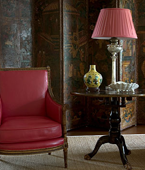
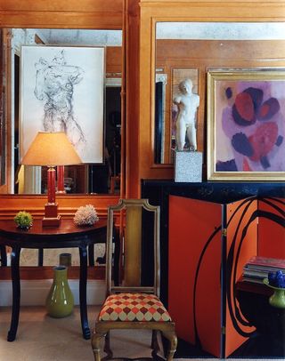
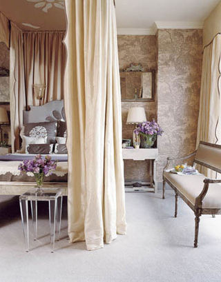
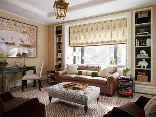
I recently became acquainted with the gorgeous work of Santa Monica based interior designer Kim Alexandriuk and as soon as I saw her portfolio I thought to myself that her style reminded me of Michael S. Smith who also happens to be one of my favorite decorators. I knew there was a reason that I became an instant fan…After reading her bio I learned that she spent six years of her career working for Smith! The similarities between Alexandriuk’s work and Smith’s are uncanny. Both have a very polished look, grounded in traditionalism with lots of ethnic influences woven throughout and a few modern elements thrown in for good measure. Designers often borrow ideas and source inspiration from one another and its inevitable that after working for a well established designer for a number of years, the younger protégé’s work will be heavily influenced by that of her former mentor. I wouldn’t doubt it if Alexandriuk utilizes the same resources and craftsmen that she discovered while working for Smith. In the photo above from Alexandriuk’s portfolio, a chinoiserie screen is used as a backdrop for a chic seating arrangement. Below is photo of another beautiful room designed by Alexandriuk in which she incorporates this same design element.
This is an idea that Smith uses quite often in his designs. Below is a room in Smith’s Bel Air home as featured in the March 2007 issue of Elle Decor.
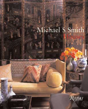
The room is also featured on the cover of Smith’s newest book, Houses, which I just purchased. (The book, by the way is amazing!)
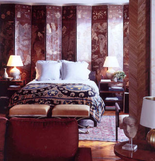
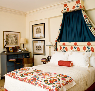
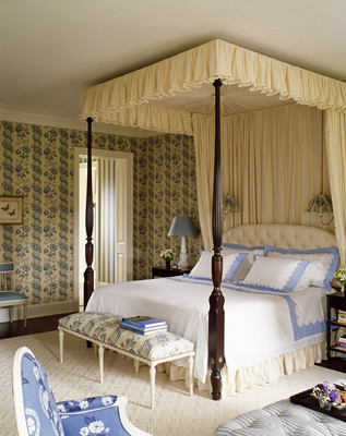
Here’s another room designed by Smith where he incorporates a chinoiserie screen as a backdrop for a well dressed bed. Smith is such a master at mixing various ethnic elements and this room is no exception. The artful mix of the suzani bedspread, threadbare oriental rug and the chinoiserie screen is perfection.
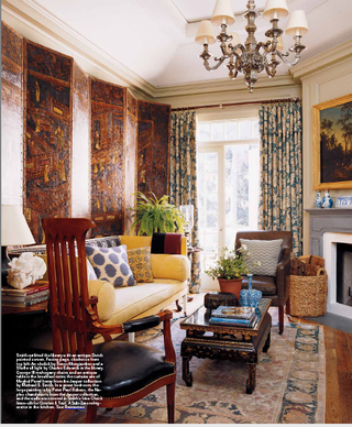
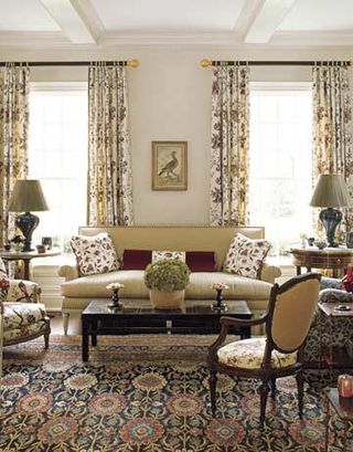
Here is the living room in Smith’s home. Notice the many layers of patten here in the rug, the sofa upholstery, the throw pillows, etc. There are also many ethnic influences here, especially in the textiles.
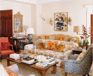
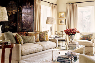
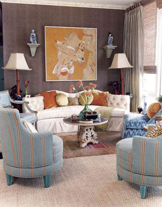
The photo below is of an Alexandriuk designed living room which has a very similar look and feel to Smith’s room above. The most striking commonality is the masterful layering of pattern.
After spending time comparing the work of Michael S. Smith and Kim Alexandriuk I thought it might be fun to compare the work of a few more of my favorite designers and their protégés to see how the styles of the younger designers were influenced by their well established counterparts…
Miles Redd & Nick Olsen
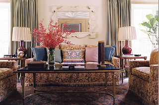
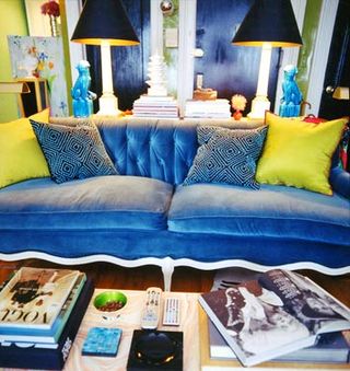
Designer Miles Redd is known for making bold statements in design. He has a passion for color, loves to combine disparate textural elements, embraces maximalism and isn’t afraid of the hi-low mix. The photo below is a perfect example of an artfully cluttered yet polished looking Redd designed room.

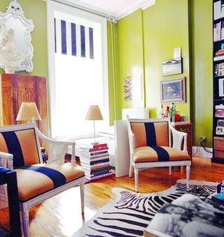
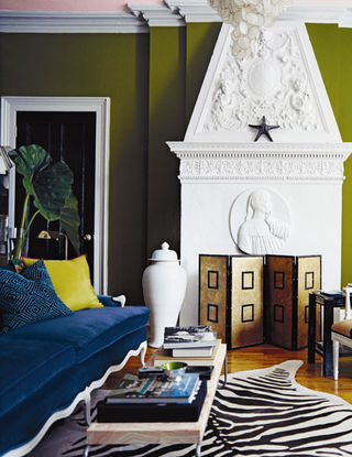
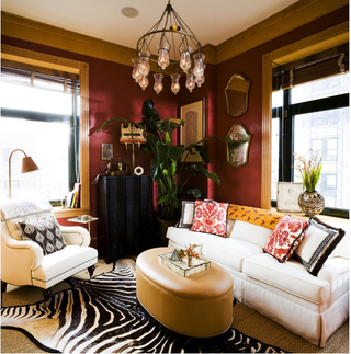
I love when designers aren’t afraid to make dramatic statement and Olsen’s bright green high-golss walls, the stripes on the chairs and window treatments as well as the zebra rug are definitely bold gestures. Note how Olsen incorporates stacks of books into his design and uses them as pedestals exactly as Redd does in the top photo. It’s clear that Olsen embraces a more is more design philosophy. He also exhibits a craftiness that makes me slightly envious. Take the window shades for example. He painted the black stripes onto a simple white roller shade and the result is fabulous.
Here’s a similar screen in a gorgeous Redd designed room. On to our next comparison…
Celerie Kemble & Sara Gilbane
I’ve long admired Celerie Kemble and her youthful, modern approach to traditional design. Rather than adopting a “signature style,” Kemble feels its more important to let her clients taste and personality guide her design approach. Creating spaces that are a true reflection of its owner is the premise behind Kemble’s new book, To Your Taste, which is due to hit shelves on November 4. I can’t wait!
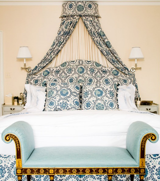
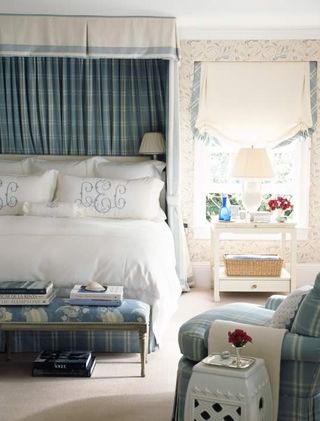
This photo is one of my favorites from Sara Gilbane. She too loves to frame her beds with curtains but rather than using a full canopy like Kemble, she seems to prefer a smaller valance with curtains cascading just at the head of the bed.
Here’s another Gilbane designed bedroom which also features a curtained valance framing the top of the bed. I love Gilbane’s choice of ethnic inspired fabrics here and in the photo above. Her generous use of ethnic prints and patterns could be one detail that sets Gilbane apart from Kemble, who’s seems to use such prints a bit more sparingly.
Markham Roberts and Ashley Whittaker
Just like Michael Bargo, up-and-coming interior designer Ashley Whittaker was also included on the Domino 10 list in 2007. Whittaker got her training working under renowned designer Markham Roberts and its obvious that he influenced her design style significantly. Robert is a traditionalist at heart. His rooms are classic, well tailored and filled with doses of fresh color. Whittaker shares a similar design sensibility.
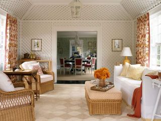
This living room was designed by Roberts for the home of a young family in Connecticut.
And here is a living room designed by Whittaker for clients on the Upper East Side of Manhattan.
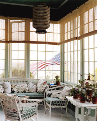
Similarly, Whittaker also chose wicker furniture to dress up a sunroom in this Southampton home.
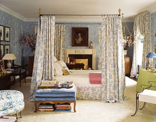
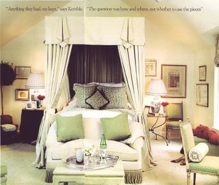
Whittaker and Roberts both seem to have an affinity for blue and white in the bedroom. Here is a bedroom that Roberts designed for his Washington summer home. The curtain framed bed looks so romantic and inviting. I’m really starting to love this look.
Here’s another blue and white bedroom by Roberts.
This bedroom was designed by Roberts. It has a very similar look and feel to the Roberts designed bedroom above. Again, I’m really loving the canopied bed with curtains.

A design element that I’ve seen repeated in various Markham Roberts’ projects is the use of large blue and white porcelain jars placed on the floor under console tables or in an empty corner.

Whittaker often uses the same design trick. Here, she placed two large ginger jars underneath a stylish Asian console table.
Thomas O’Brien and Michael Bargo
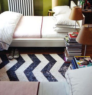
You may remember Michael Bargo from being on the “Domino 10” list of decorators to watch in 2007. This former assistant to Thomas O’Brien started his own decorating firm at the age of 24 and his work is definitely reflective of his former mentor’s style in many ways. Take his apartment below which was featured in the April ’07 issue of Domino.
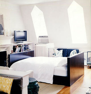

This is O’Brien’s bedroom as featured in Elle Décor. Although O’Brien’s apartment has a separate bedroom, he chose to put his bed in the living room, while the bedroom became a dressing room and study. O’Brien’s living/sleeping room has a light, airy quality with its bright white walls and notice the, simple bed frame. Perhaps Bargo looked to O’Brien for inspiration before beginning the design of his own place?
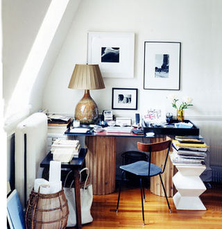
This is Bargo’s office area. Controlled clutter is the theme here.
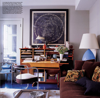
In O’Brien’s study, clutter is organized in a stylish vintage secretary. A plush chocolate brown sofa provides seating.


2 Comments
This post is FABULOUS. So thoroughly researched and well presented. I’ve thought the same thing about several of these pairs, but never done a side-by-side. LOVE.
Thanks so much Keehnan! Glad you enjoyed it!!